
A Scattering of Service Companies Under One Unified Brand
A cohesive visual system designed to support multiple property services under one name.
The Project at a Glance
HAPPY HOUND PROPERTY SERVICES
Happy Hound Property Services is a full-service property and home services company offering 6 main services: lawn care, tree services, snow removal, pest control, handyman work, and junk removal. With so many offerings under one name, they needed a brand that felt friendly and trustworthy, while still being clear and easy to navigate.
To support that growth, I created a comprehensive brand system designed to bring consistency across all services without losing flexibility. Deliverables included an overarching brand logo, individual sub-brand logos for each service, responsive logo variations, custom service icons, and a detailed brand guide. The result is a cohesive, recognizable identity that allows each service to stand on its own while still feeling unmistakably part of the Happy Hound family.
Keeping it in the Family
THE CHALLENGE & GOAL
Happy Hound had grown into a collection of services, each doing great work, but visually, they felt like separate businesses rather than parts of one bigger story. With lawn care, snow removal, pest control, handyman work, and more all operating under the same name, there was a real need for everything to feel connected.
They were looking for a brand tone that felt like them and a way to tell their story clearly across every service. The challenge was finding that balance: making each service easy to recognize on its own, while still making it obvious they all belonged to the same Happy Hound family.
The Look, Unleashed
THE PROCESS
We first started with an in-depth conversation to better understand and develop their brand story and identity. I then did a lot research into the property services industry, looking into successful brands that were playful and friendly, but still on topic.
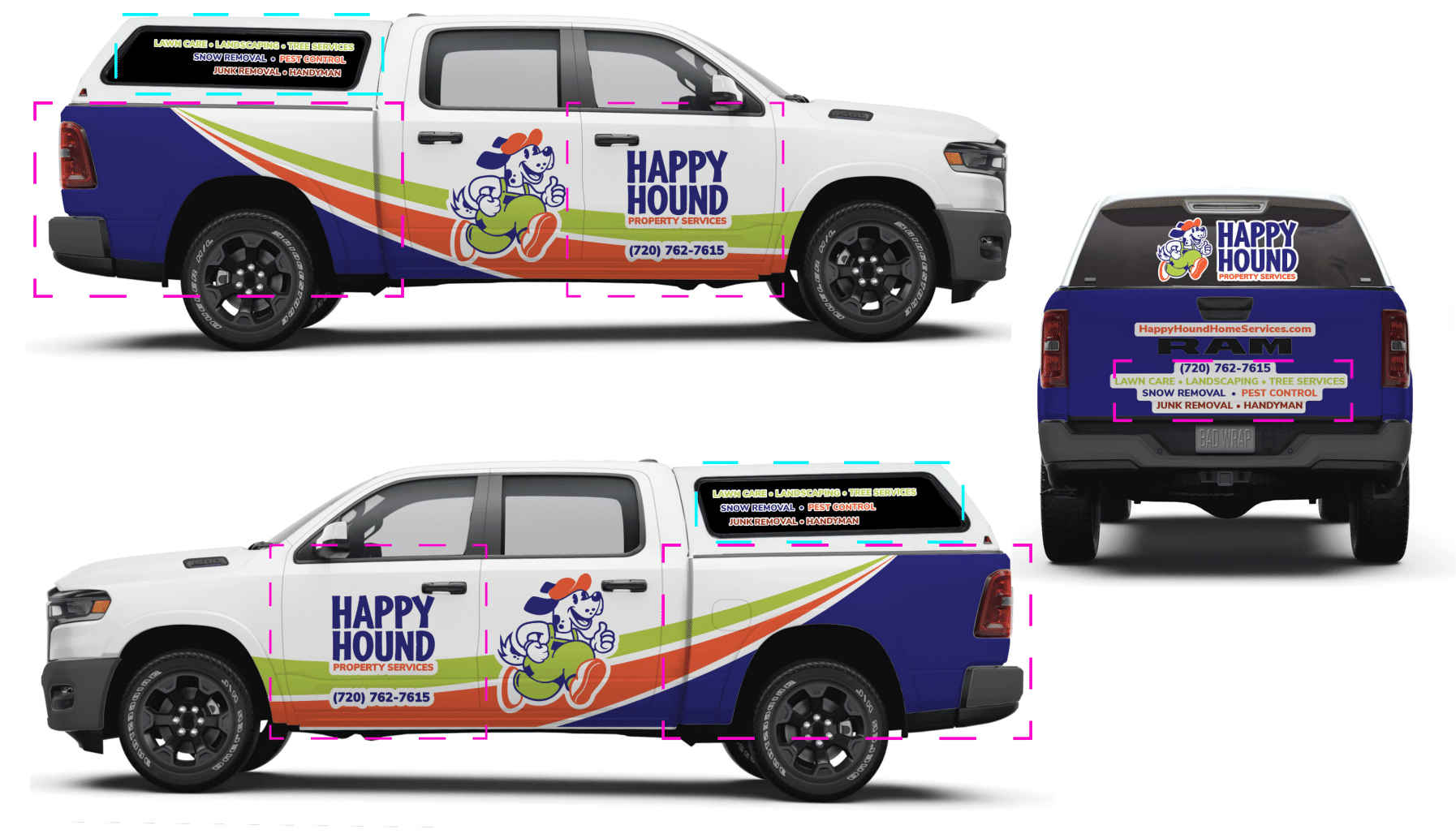
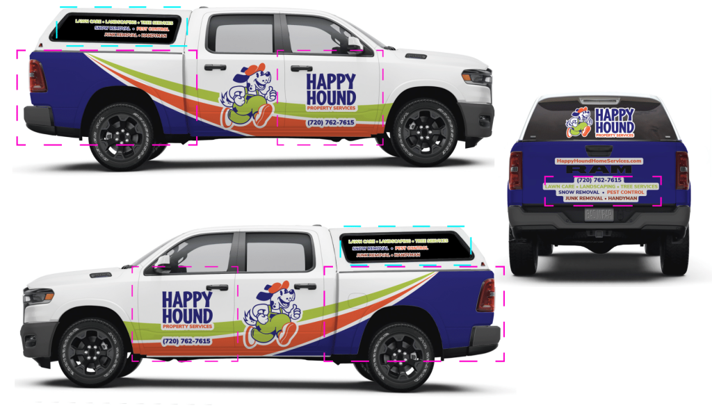
As for the design concepts, the client's main request was to include a dog caricature that could be used as a mascot and eventually be made into a plushie and eye catching merch. These designs also had to take into consideration requirements for embroidery and an eventual truck wrap.
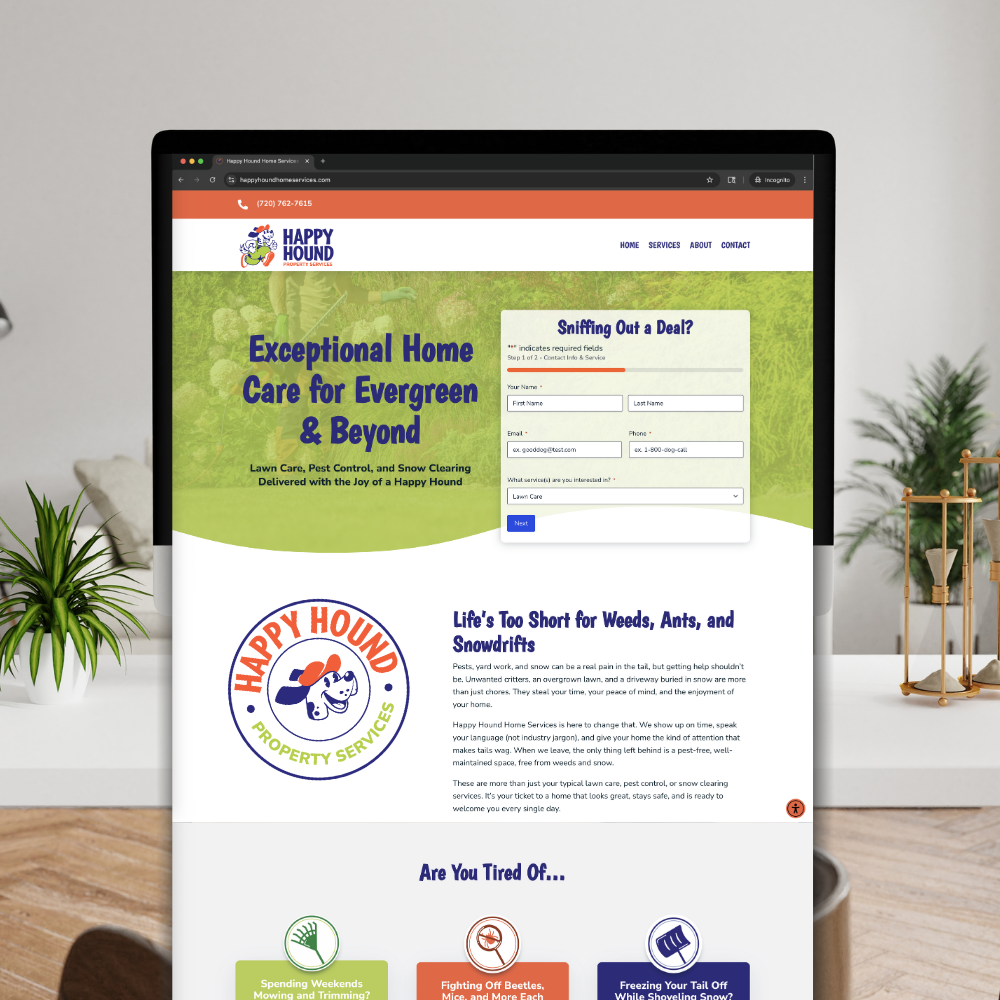
This client also had a name change early on in this project, going from "home services" to "property services," as they discovered they wanted to also reach commercial clients.
THE DESIGN - MAIN BRAND
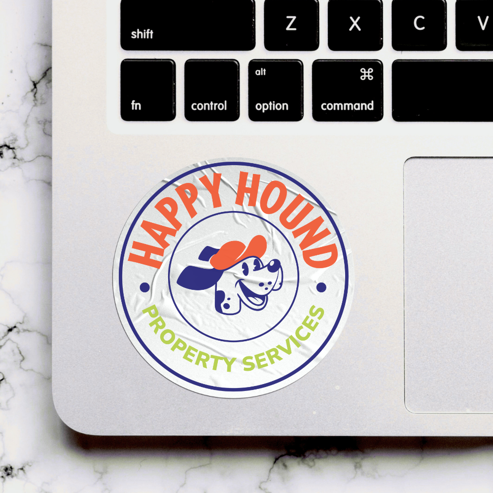
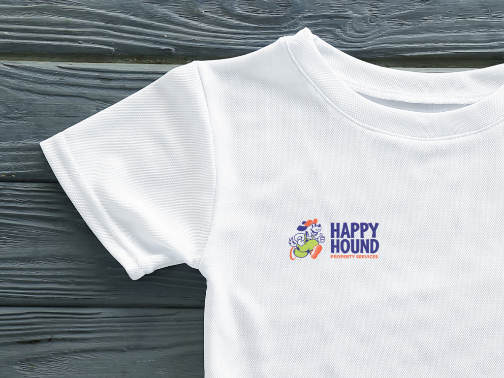
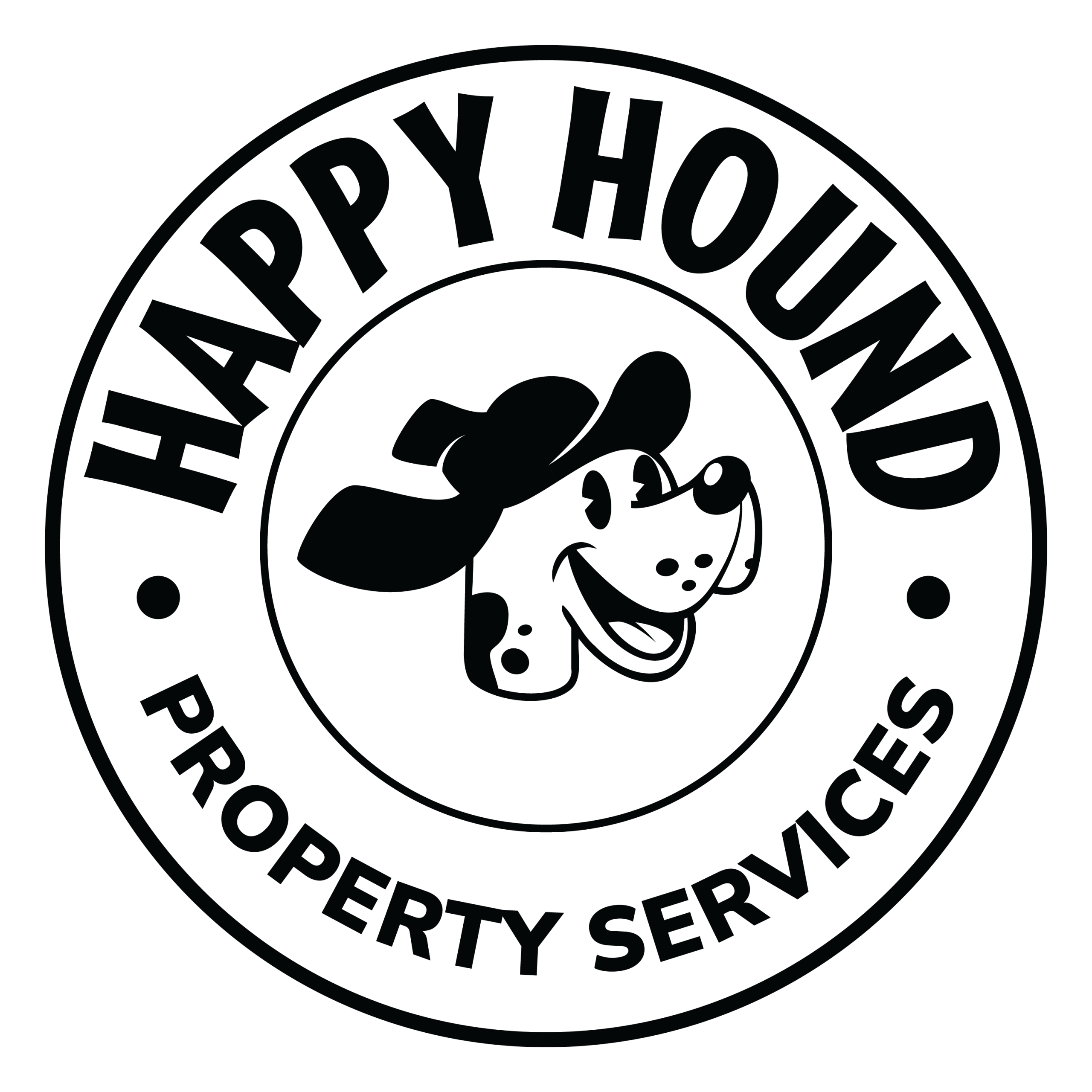
After playing with several designs for the dog and typography, we settled on a combo between a retro-style character and playful font that was simpler and more readable across assets than its heavily retro-inspired origins. After nailing down the horizontal and badge orientations, I expanded into the rest of the responsive designs.
THE DESIGN - SUB BRANDS
The six sub brands each include the hound holding a different service-related object. However, I knew from the start that each would need further differentiation between the each service and parent brand. This is when we began to experiment with color. The parent brand's colors where chosen with potential sub brand colors in mind. All sub brands contain one of the main brand's colors, plus 1-2 additional colors with a slight variation in value or hue.