A Fresh Face in Esthetics
A brand identity designed to feel elevated, feminine, and professional.
The Project at a Glance
HIGH DEFINITION ESTHETICS
High Definition Esthetics is a new esthetics business focused on delivering luxury, custom skincare services in a way that feels friendly, natural, and feminine. As a startup, they needed a brand identity that could make a strong first impression while still feeling warm and personal.
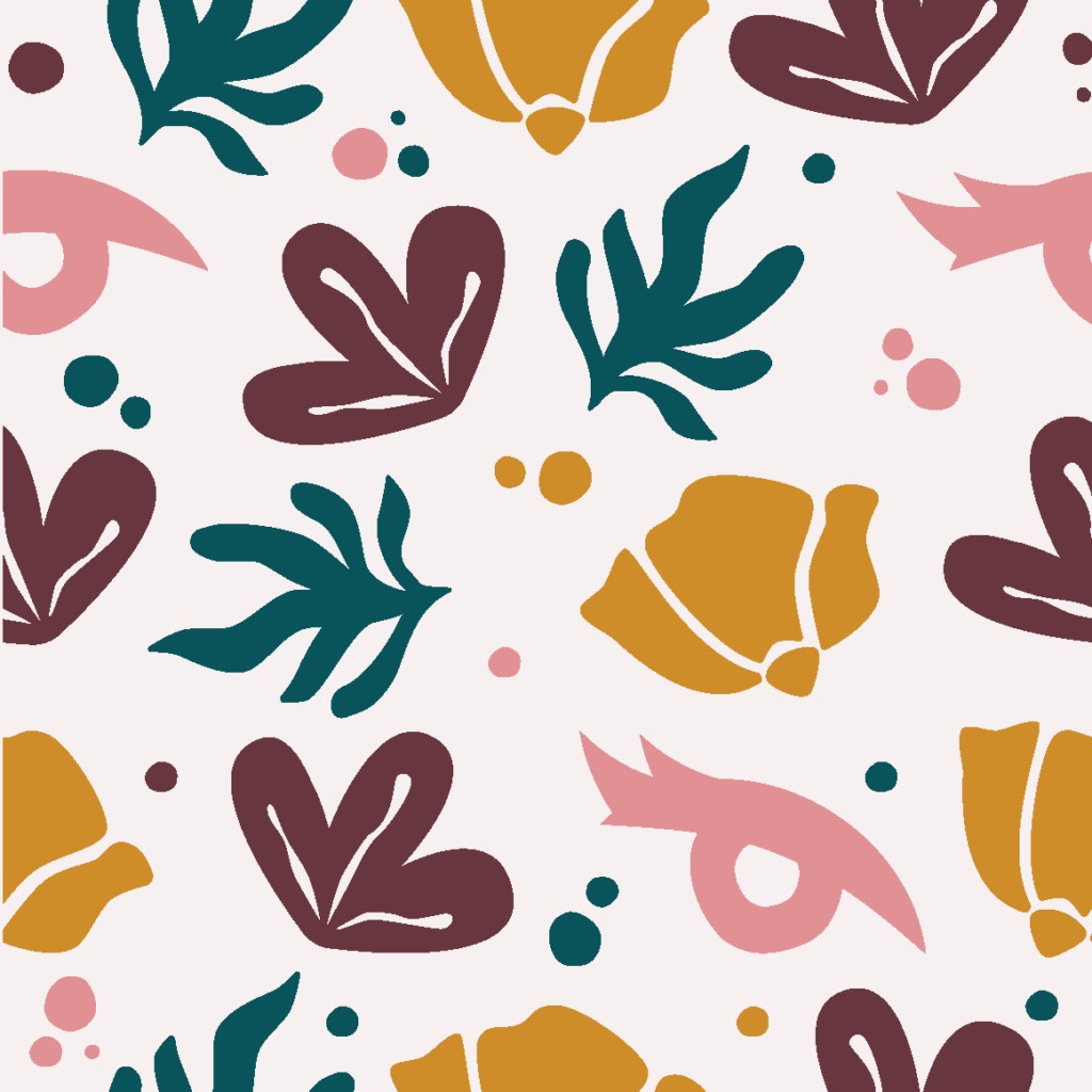
The project included a custom logo and supporting brand elements such as icons and a pattern designed to reflect their expertise. The final identity balances elevated design with a youthful, modern feel, helping High Definition Esthetics stand out in a crowded beauty space while staying true to the experience they offer clients.

Beauty in the Vision
THE CHALLENGE & GOAL
High Definition Esthetics was starting from scratch, which meant there was a lot of decisions to make. The brand needed to feel luxury and elevated, but not stuffy or intimidating. It also needed to feel friendly, natural, feminine, and youthful, without slipping into anything overly trendy or generic.
The challenge was pulling all of that into one clear direction. The goal was to create a brand that felt polished but personal, confident but welcoming. Something that reflected the care and customization behind the services, and made clients feel comfortable booking from the very first impression.
The Look, Polished
THE PROCESS
Every brand design starts with a conversation and this was no different. We discussed more than how she should sound and look, but how her business should feel. After talking and getting some ideas of what she as the client also liked or did not like in design, I looked into successful beauty brands to find what elements were working and how we could stand out. This was a bit of a challenge, as this particular client definitely wanted a face in her logo, which is typical iconography when it comes to brands like hers.
So, when designing concepts, two included a face in the brand mark. While I also conceptualized an abstract option without the face just in case we ended up wanting to move in that direction, one leaned more natural and friendly, while the other (the one chosen) was slightly more abstract.
THE DESIGN
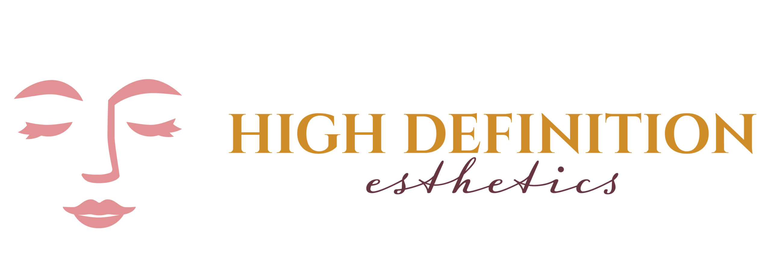
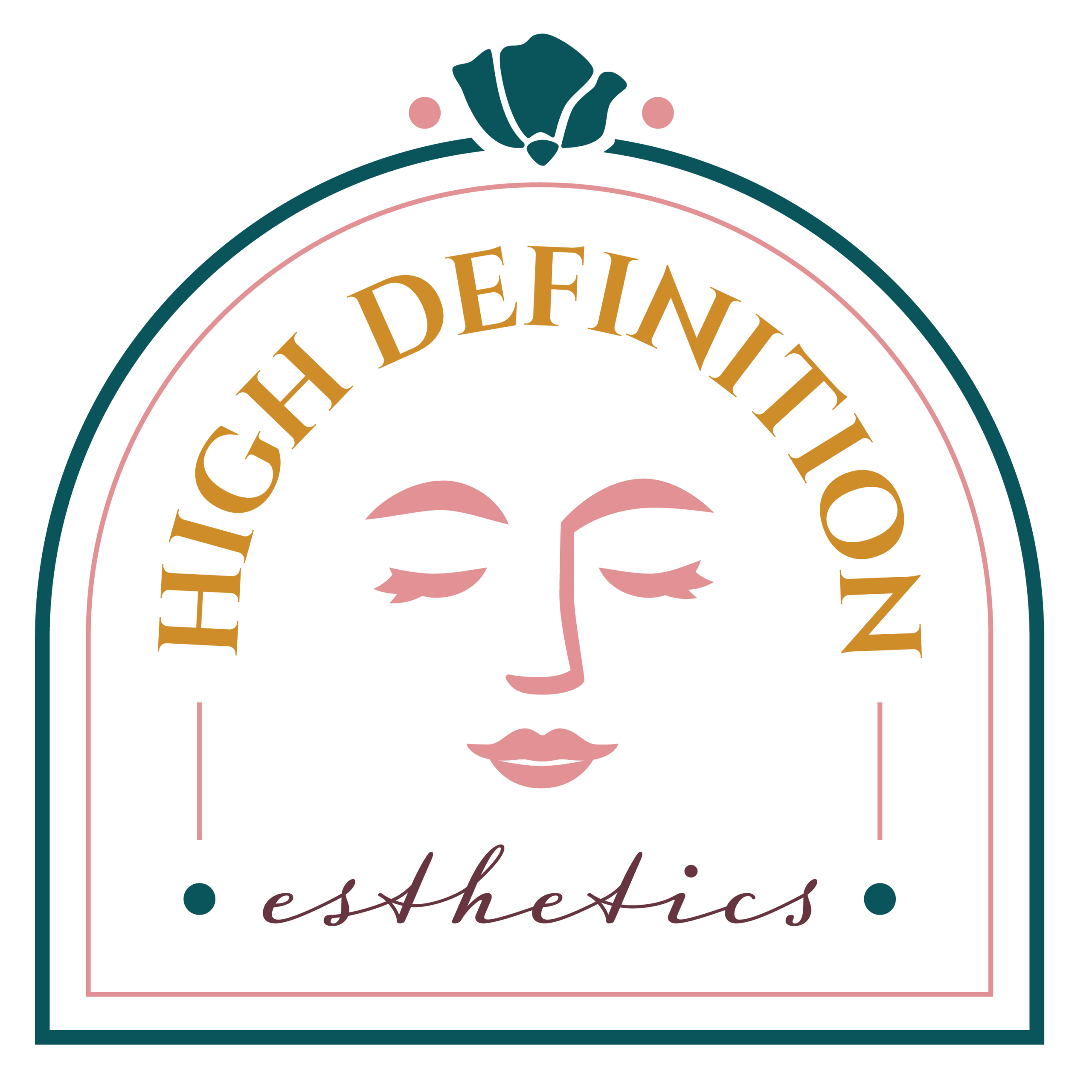
The final logo started with the mark: a relaxed, simplified face that would make an easy stamp and be quick to identify. The simple line work and face's pose help speak to the natural, relaxing tone of the brand, while the clean, bold shapes and typography beneath help boost the femininity and luxury of the brand.
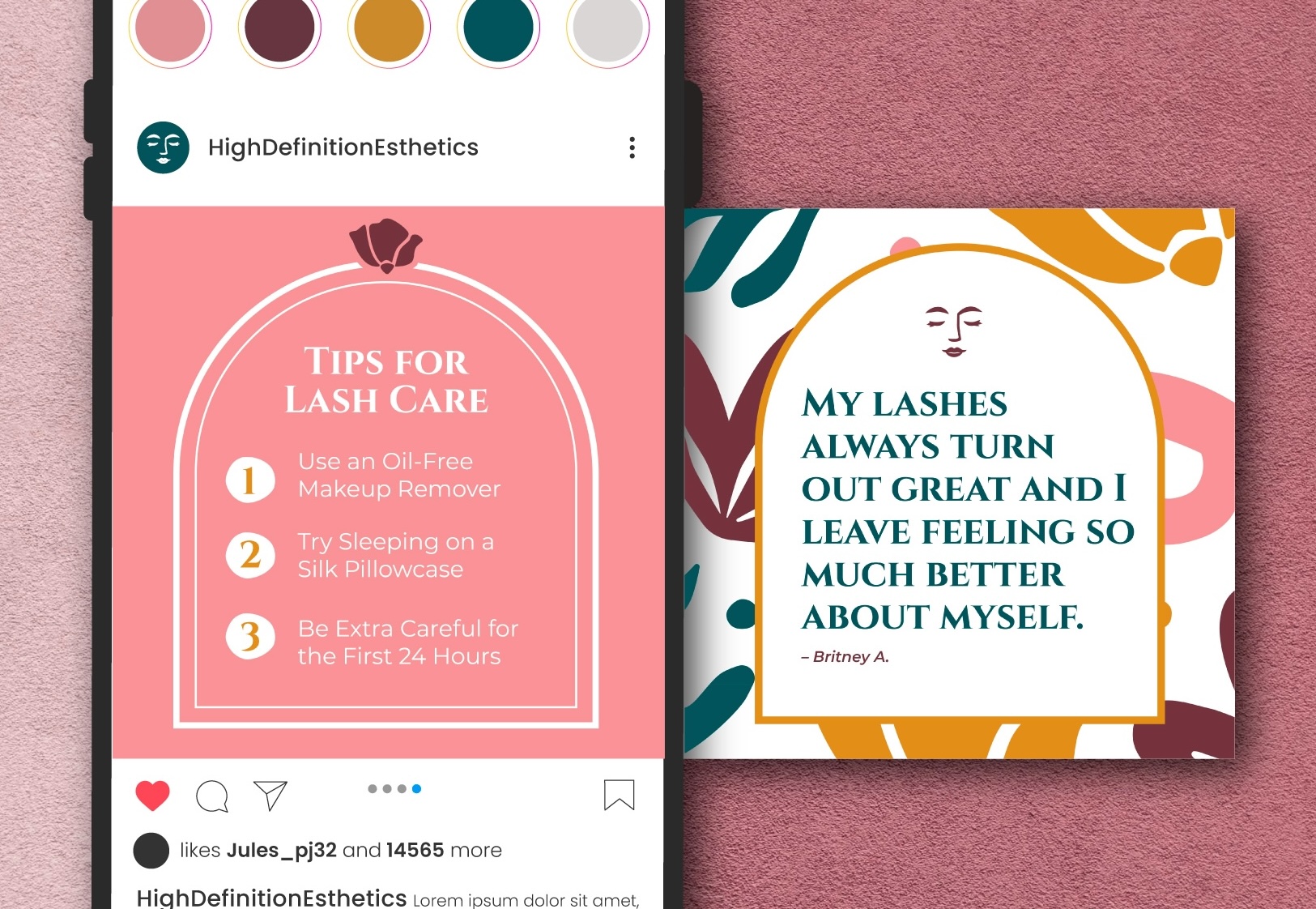
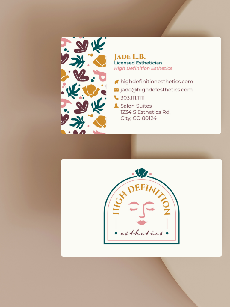
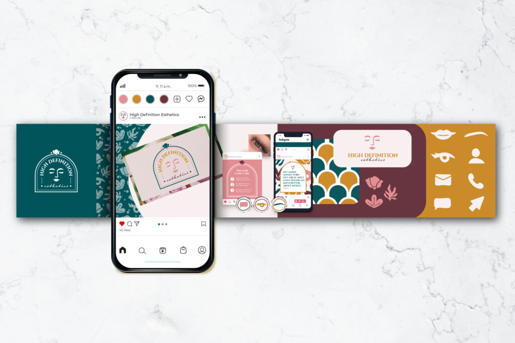
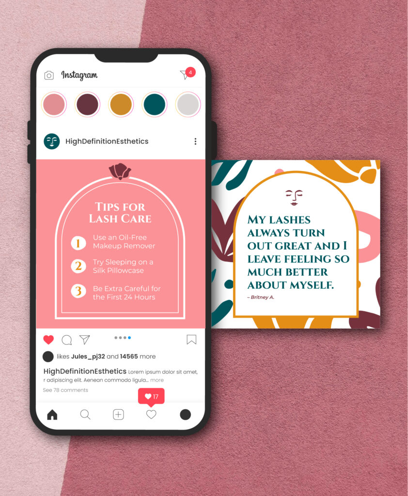
The other branded elements, such as the icons and pattern, also follow the simplicity of the mark. The icon elements are used in the primary pattern, but can also be used as elements such as contact icons, service icons, or Instagram highlight covers. The patterns themselves are repeatable and resizable so they can be used in any format.