
Designing the Real Estate Process
Posters and flyers designed to educate, engage, and support real estate clients.
The Project at a Glance
RED COMPASS REALTY
Red Compass Realty helps clients navigate buying and selling homes with clarity and confidence. When we started working together, they had a logo, but that’s all. There were no other elements to carry their look consistently across their client-facing materials.
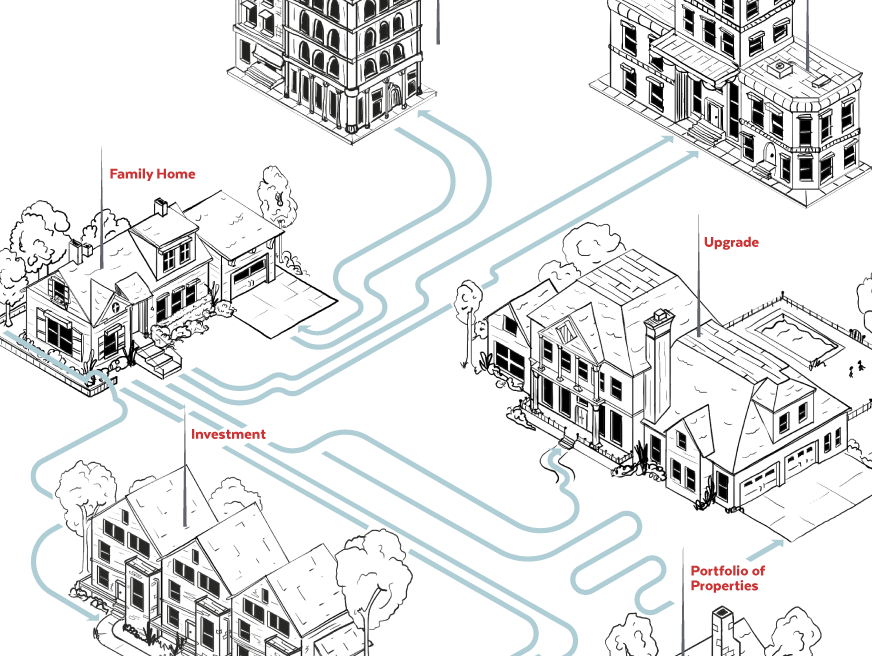
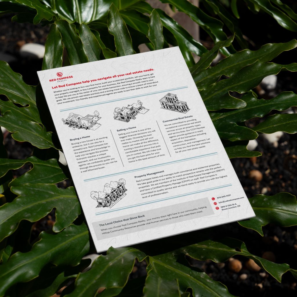
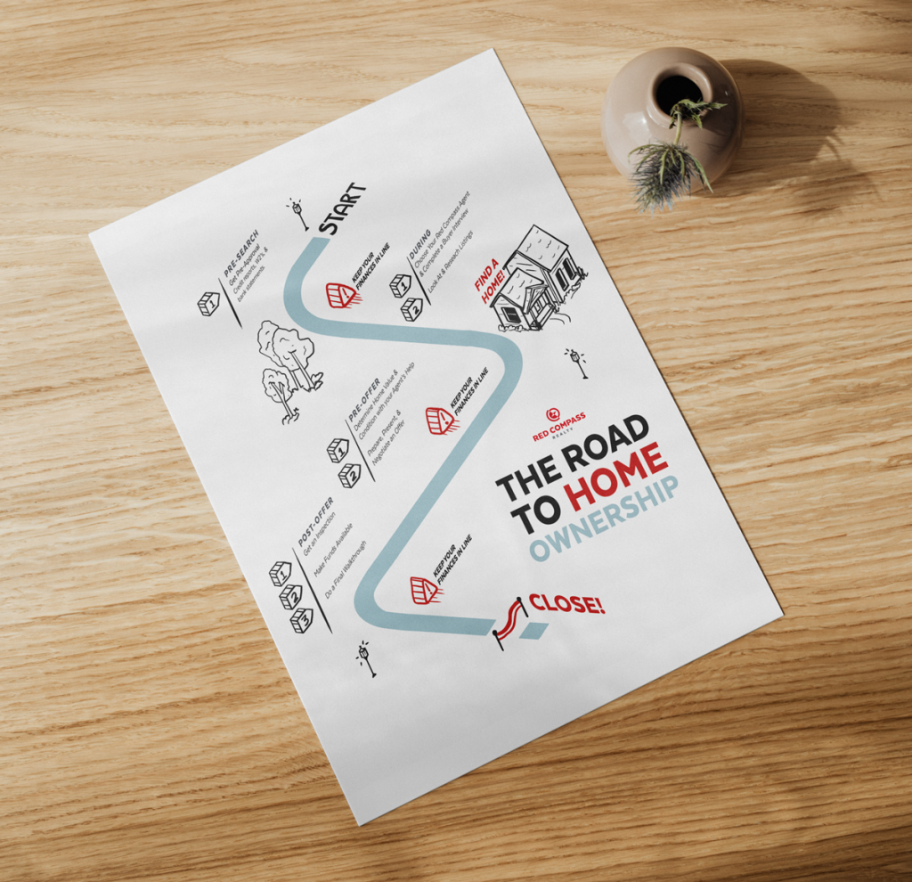
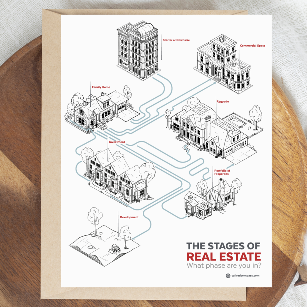
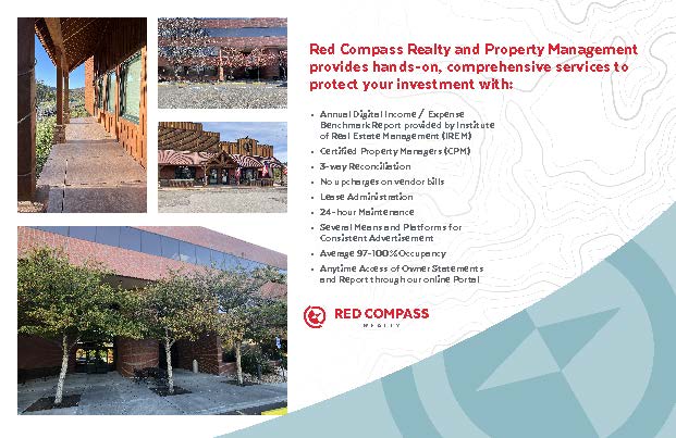
One of the many projects for this client included a set of informational posters and flyers meant to be used in packets for both active and prospective buyers and sellers. Along the way, I expanded their visual brand with additional colors and graphic elements to create a more cohesive system. Hand-drawn illustrations, infographic-style layouts, and thoughtful typography helped break down complex real estate information into something that felt approachable, clear, and easy to follow.




Finding the right Direction
THE CHALLENGE & GOAL
Real estate is full of steps, timelines, and terminology that can feel overwhelming, especially for first-time buyers and sellers. Red Compass Realty wanted a better way to walk clients through the process without making it feel intimidating or dense.
The challenge was twofold: clearly explain a lot of information, and do it in a way that felt cohesive and on-brand. With only a logo to start from, the designs needed to do a little extra work building out a visual language that could hold everything together while still keeping each piece clear, helpful, and easy to understand at a glance.
Designing for Direction
THE DESIGN
Their original colors were just the black plus the gray and red of their logo. In the brand expansion process, I swapped the black for a less harsh dark gray and added a light blue as an accent color. I then developed some visual brand guidelines such as typography, using isometric illustrations, where and how to place the topographic background pattern, and developed some "swooping" shapes for graphic accents in order to allude to the circle of the compass logo.