New Charcuterie Brand Launches With Creative, Elevated Design
A strategic brand identity created for a new player in the luxury food space.
The Project at a Glance
3 OLIVES CHARCUTERIE
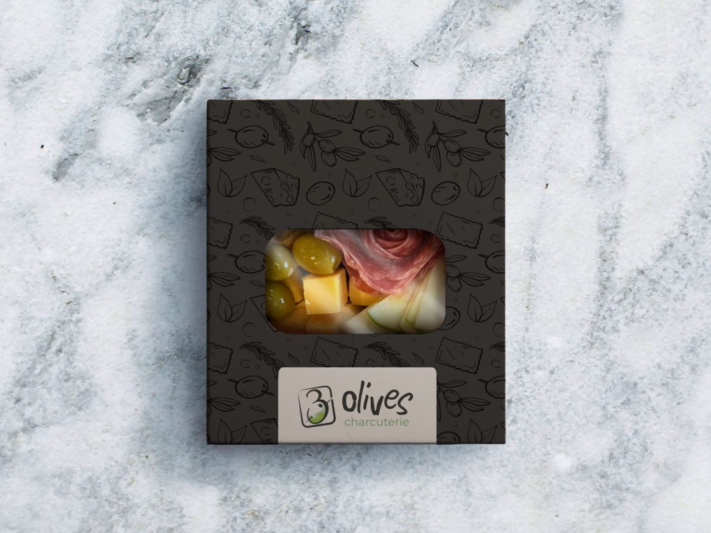
3 Olives Charcuterie is a creative food startup bringing elevated charcuterie to life through hands-on workshops and thoughtfully curated grab-and-go snack boxes for events and luxury brands. They came to me needing a brand that felt indulgent, flirty, and creative, without falling into the overly rustic look that’s so common in the food space.
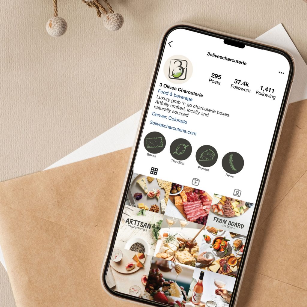
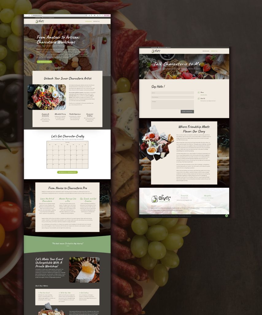
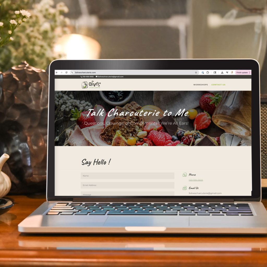
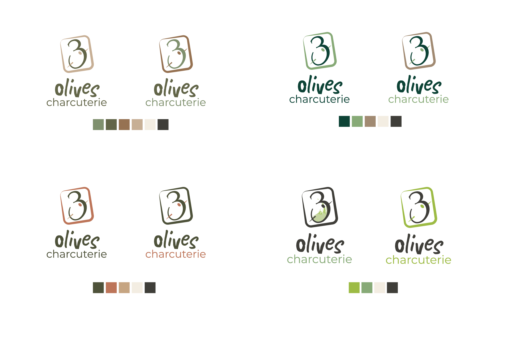
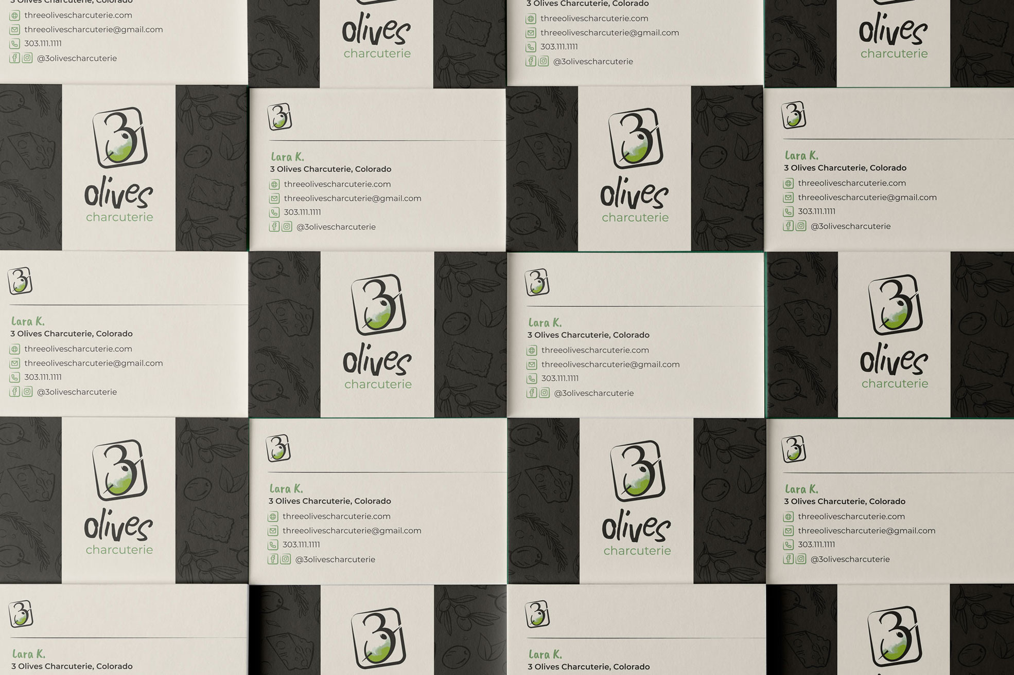
To support their launch, I created a full brand kit designed to grow with the business, including a custom logo with responsive variations, a detailed brand guide, and printed business cards for events and partnerships. I also designed their website as part of the initial rollout, making sure the brand felt cohesive and intentional across every touchpoint.
Setting the Table
THE CHALLENGE & GOAL
3 Olives was starting from scratch, with a one-of-a-kind product, but no visual story yet to support it. Their charcuterie snack boxes were anything but ordinary, and they needed a brand that felt just as distinctive.
The challenge was finding the sweet spot between playful and polished, while also implying that the locally sourced ingredients they used were organic and healthy.
Something to appeal to both local luxury brands, as well as middle-to-upper class women who just want something fun, unique, and fancy to do or eat when hosting. It needed to be a look that could feel creative and flirty without losing its sense of luxury.
The goal wasn’t just to look good, but to build a brand that matched the confidence, uniqueness, and elevated experience behind every box.
The Look, Served
THE PROCESS
As with all my branding clients, we started off with an in-depth conversation to better understand and develop their brand story and brand identity. Then, it was time for research. I looked into successful playful food brands, luxury food brands, and organic food brands separately before finding elements from each that would tie in together for the final design.
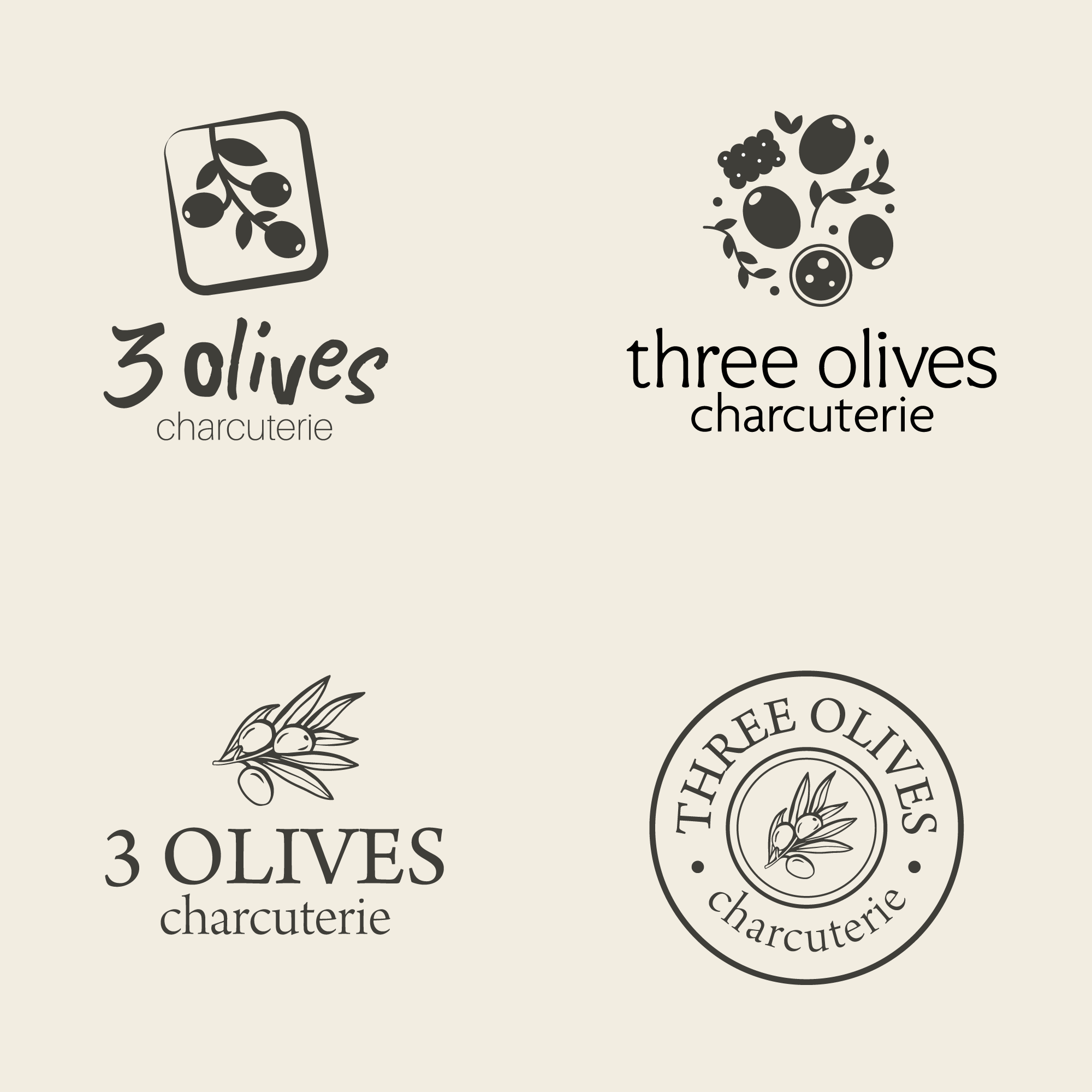
As for the design concepts themselves, a must for this client was to incorporate three olives into the brand mark. While I typically only come up with 3 concepts to present, the inspiration was running high and I ended up with 5. Other than the final design, my ideas played a lot with shape.
Ultimately, the client loved the idea of an icon in the box to nod to their charcuterie snack boxes and we ended up with our final design after a few alterations with the shape of the 3.
THE DESIGN
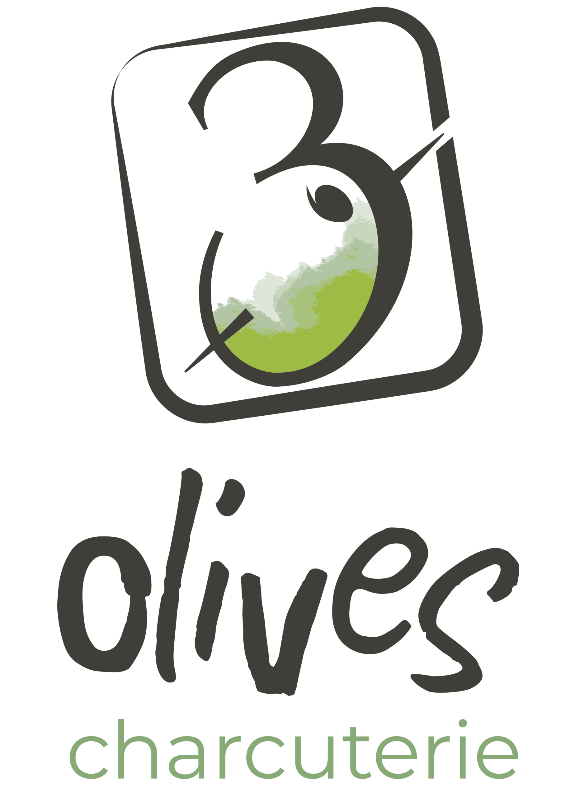
The final logo started with the mark. The variation in the weight of the box and the rounded corners nod to the organic, natural tone and the altered serif font for the 3 was in line with more luxury brands. The shape of the olive in the white space of the 3’s base brought in the unique and playful tone, while also tying in the brand name.
The typefaces and fonts needed to not only match up with the style of the brand mark, but also transfer over to any digital web design (such as email, the website, or graphics the client decided to make in programs like Canva or Google Slides) with ease. I used Montserrat not only because the letterforms helped the whole look feel more modern and luxurious, but also because of the plentiful variations it provides.
